
Creating a Unified, Bilingual Brand for Family Support Services in Durham Region
CFSD is the unification of several important family-serving charities in Durham Region. They came to sagecomm for a modern master brand and sub-brands that honoured the values and identities of former individual agencies and reflected a new generation of compassionate care, counselling and support as a unified organization. The identity system needed to facilitate a reimagined identity, palette, typefaces and iconography for CFSD and its three sub-brands, while remaining one cohesive system.
The project included new naming for one of the sub-brands (now known as Renewal Psychotherapy) and assets to fulfill CFSD’s French language services mandate. Most critically, it needed to be accessible and engaging to a diverse range of clients CFSD serves: individuals, gender-based violence survivors, young parents, couples and families.
At the heart of CFSD’s new visual identity is a flexible, human-centred system designed to unify multiple services under one umbrella—while still allowing each program to speak directly to the communities it serves.
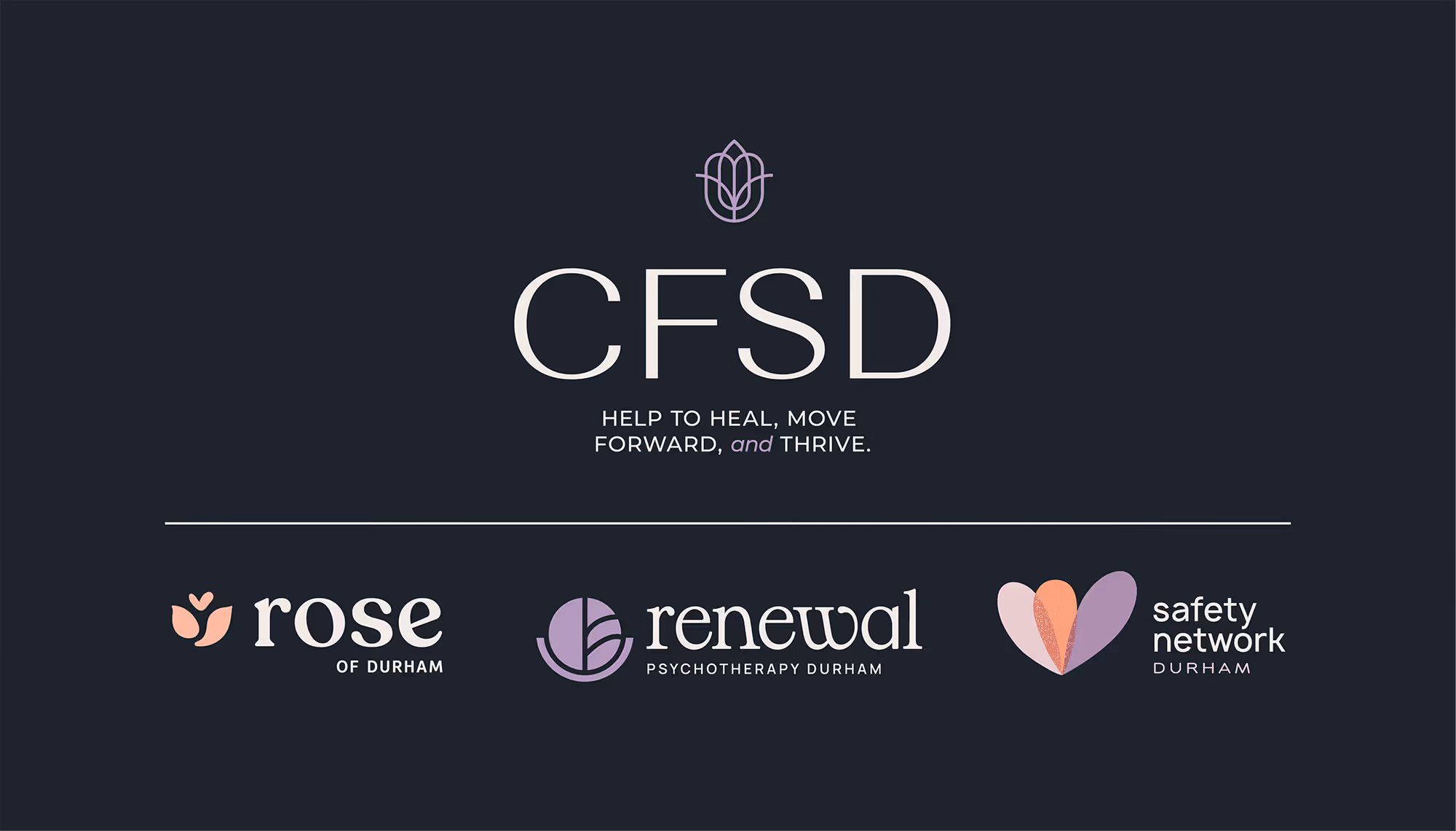
The brand architecture was built to work as a cohesive family: CFSD as the master brand, supported by three distinct sub-brands. Each sub-brand has its own visual personality, tone, and emotional register, carefully tailored to its audience, while sharing common design DNA that signals connection, trust, and belonging.
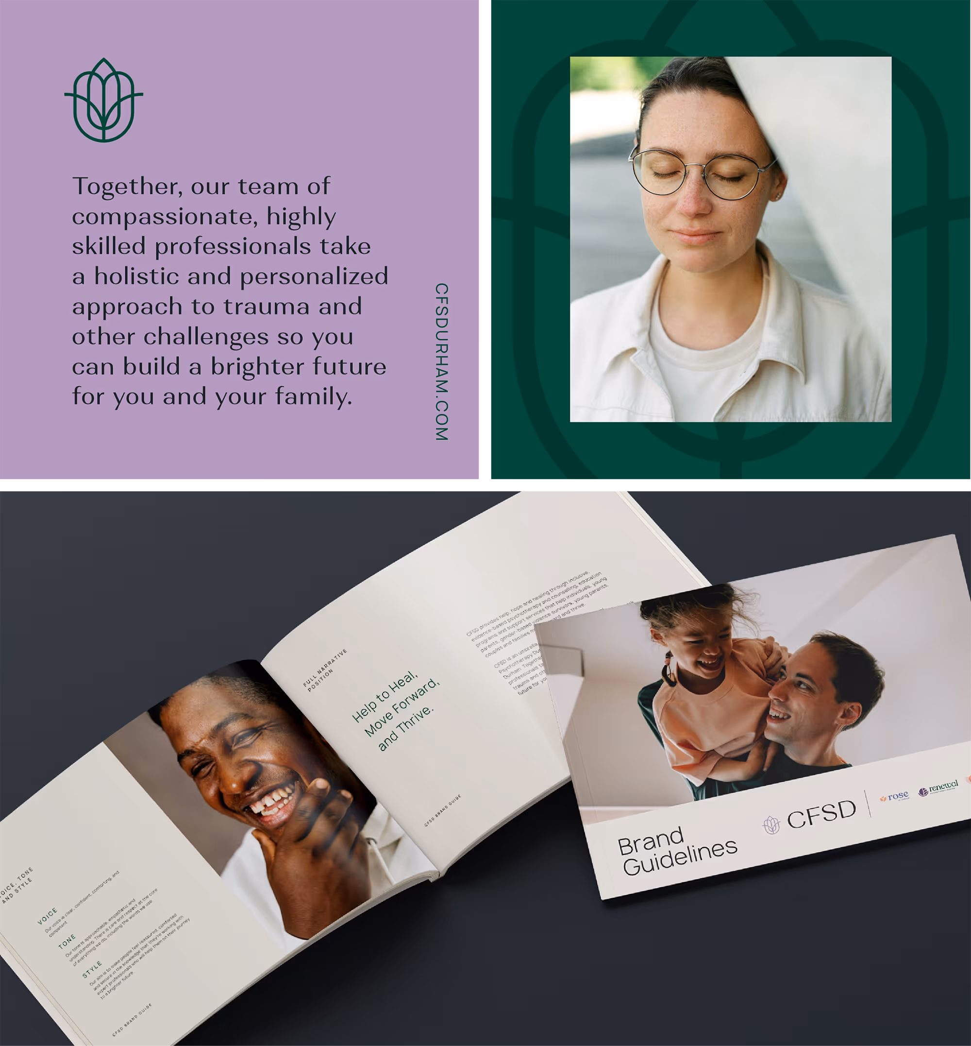
This new identity system was anchored in fresh and engaging narrative positioning for the master brand and each unique sub-brand, and translated across a number of print and digital assets, including the development of a new, bilingual website. The website design is focused on helping potential and existing clients find the help and resources they need quickly and in the language of their choice.
sagecomm also supported the integration of separate social media channels into one set of channels to tell a cohesive and comprehensive story about the work CFSD does and to help them better communicate with clients.
CFSD has reported that within six months of launching their new brand, website and social channels, they were already seeing more client intakes, and better quality candidates for employment opportunities, which they have attributed to to their new modern, clear, accessible and compelling visual identity, which aligns with their values and promise.
Services Delivered
- Research & Discovery
- Narrative Positioning
- Copy Development
- Brand Strategy & Design
- Asset Development
- Web Design & Development
- Social Media Strategy
Sector
Featured work samples

Heading
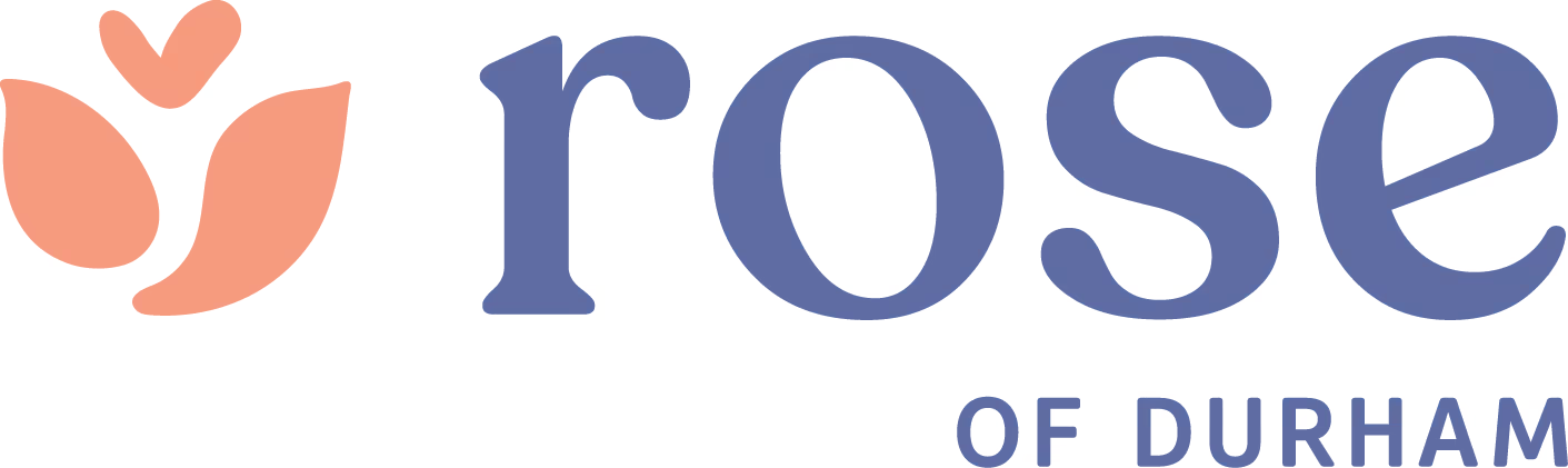
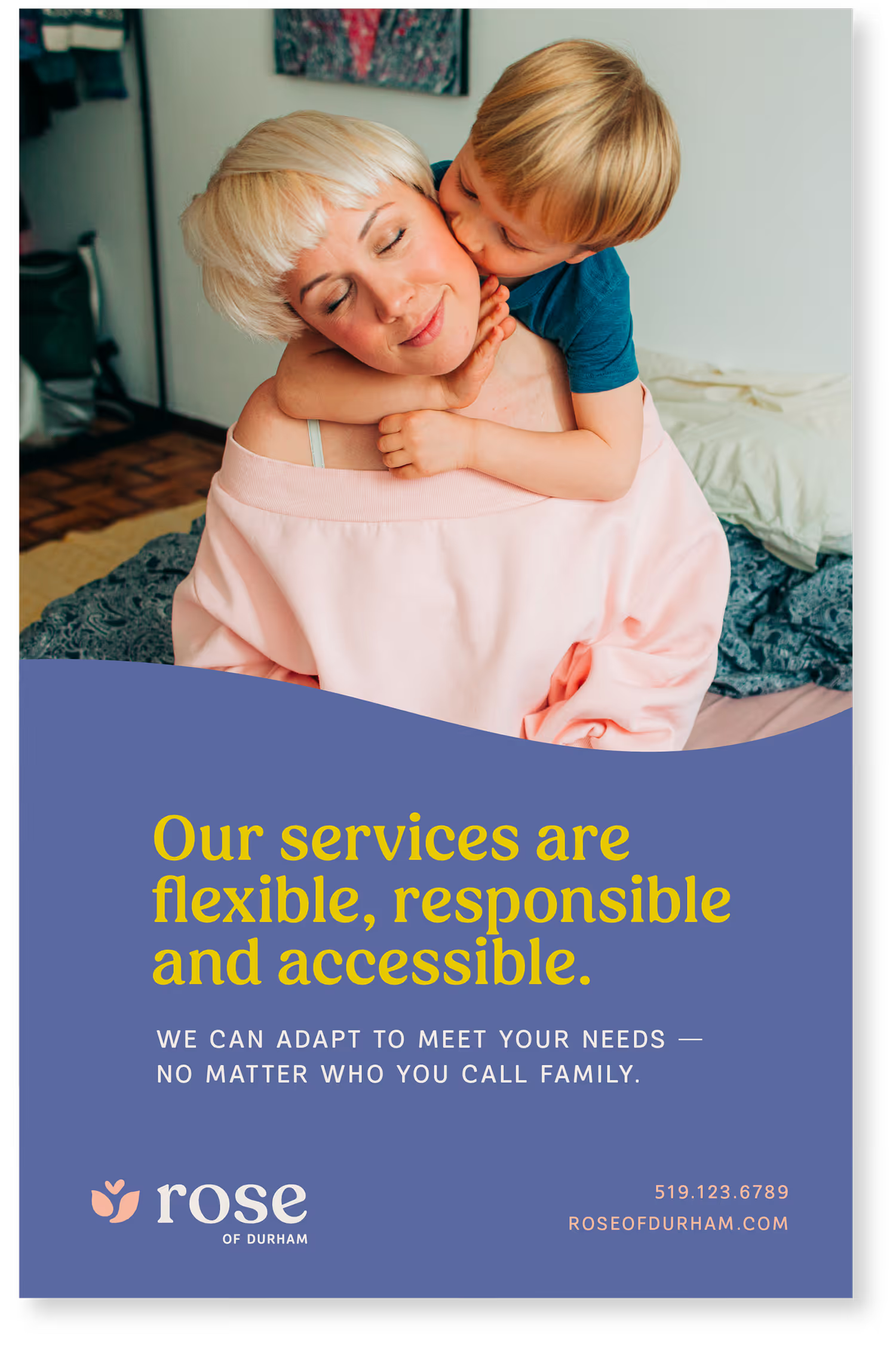
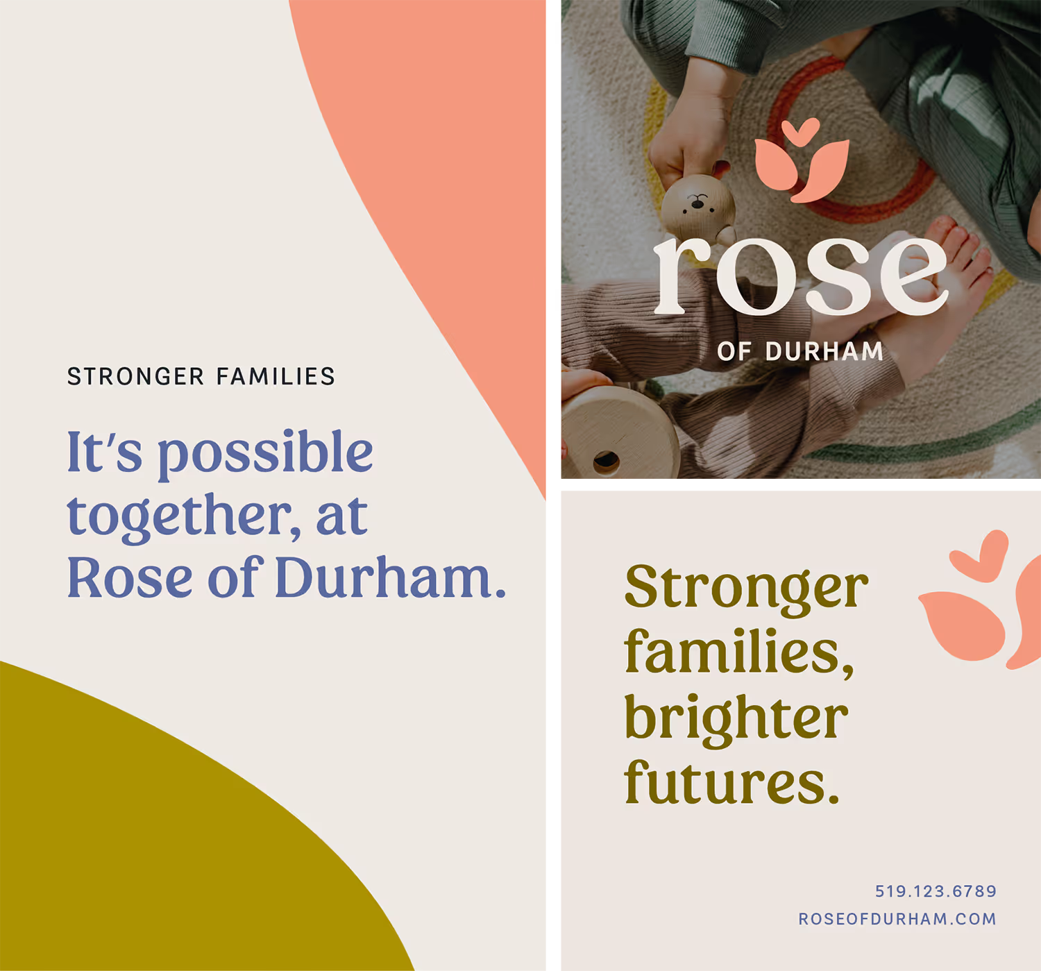
Rose of Durham's identity introduces a more playful, nurturing tone through soft typography, organic shapes, and a vibrant yet calming colour palette. The abstract rose icon symbolizes care, connection and love — reflecting the relationships between children, parents, and caregivers — while remaining visually aligned with the wider CFSD family.

Heading
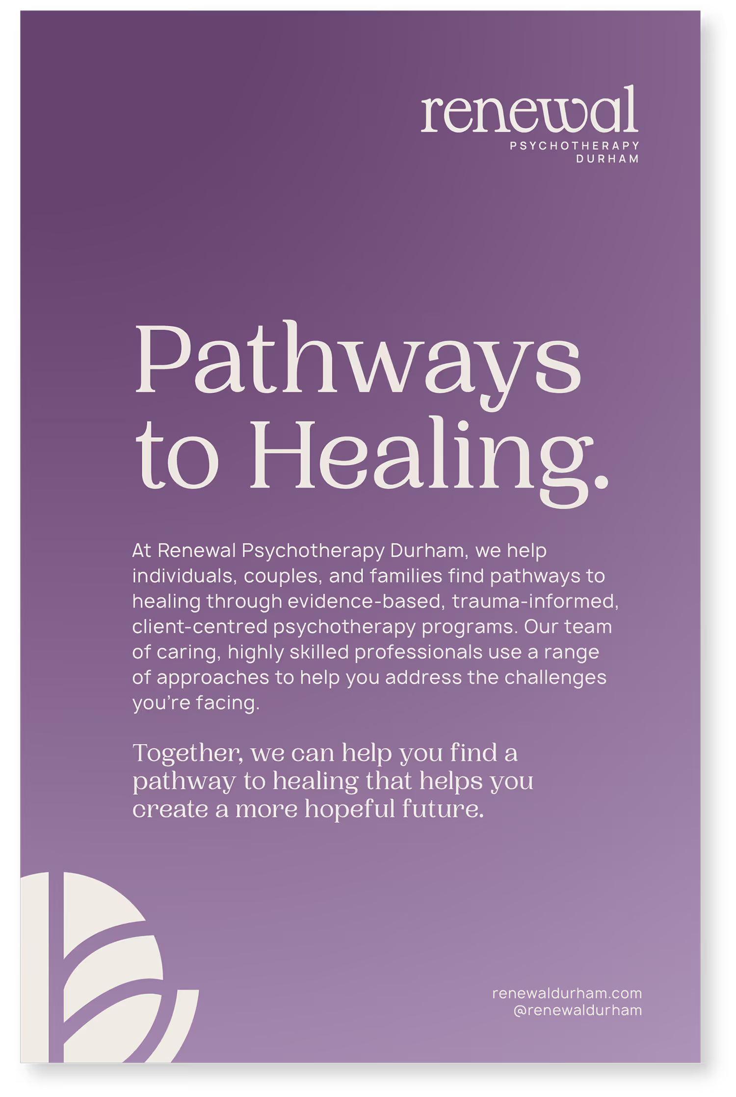
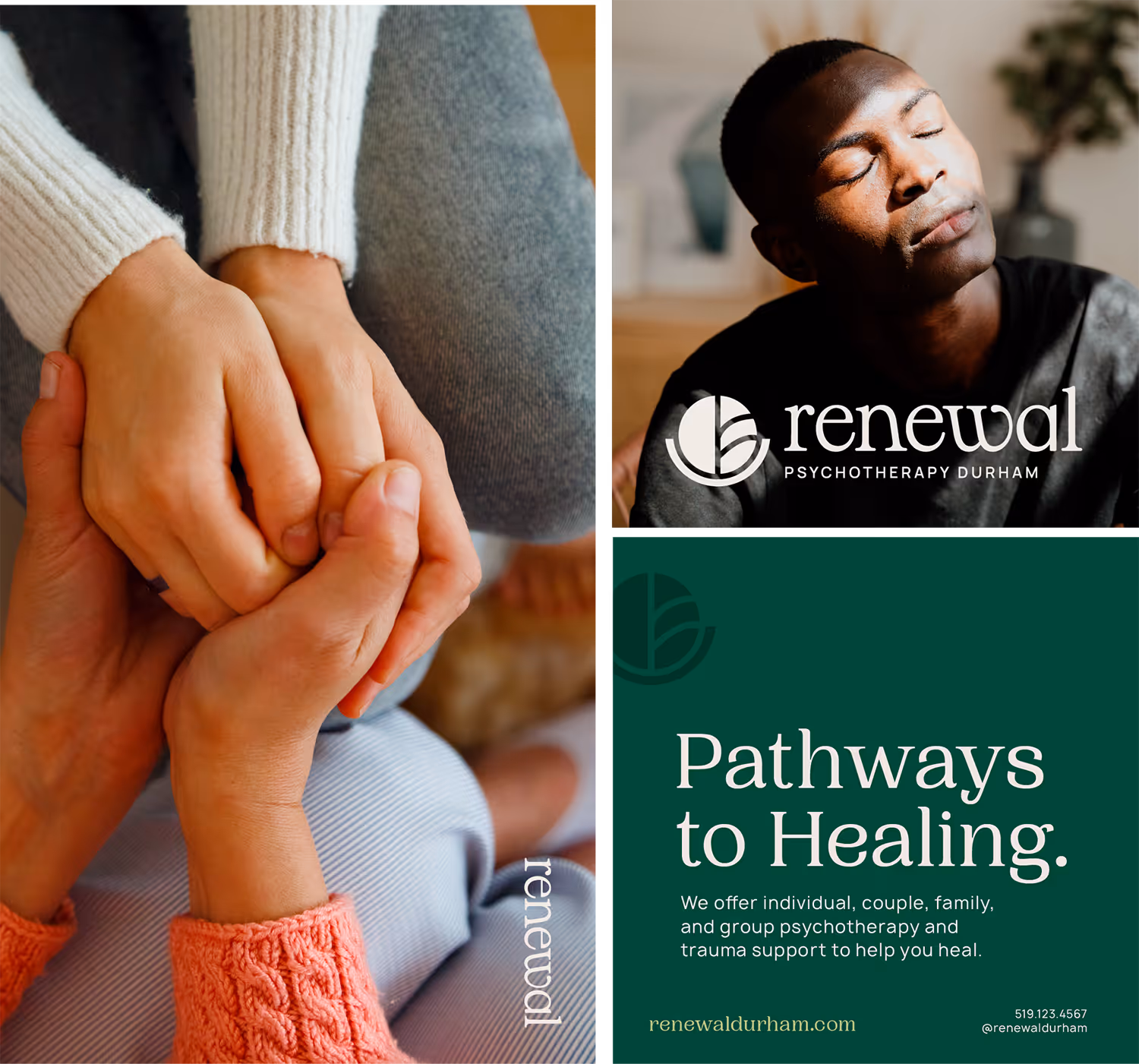
Renewal Psychotherapy Durham balances grounding, darker tones with moments of light and moment. Flowing serif typography, strong iconography and subtle gradients convey the non-linear nature of healing and personal growth. The visual system supports trauma-informed care by feeling calm, considered, and emotionally resonant without being heavy.
Heading
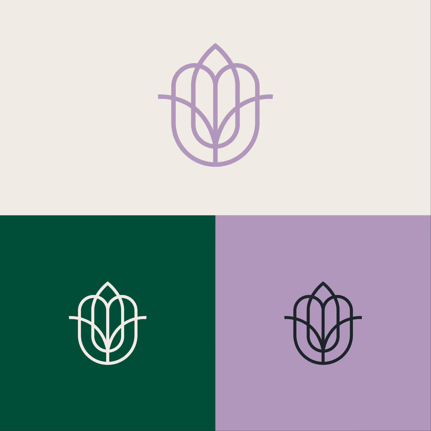
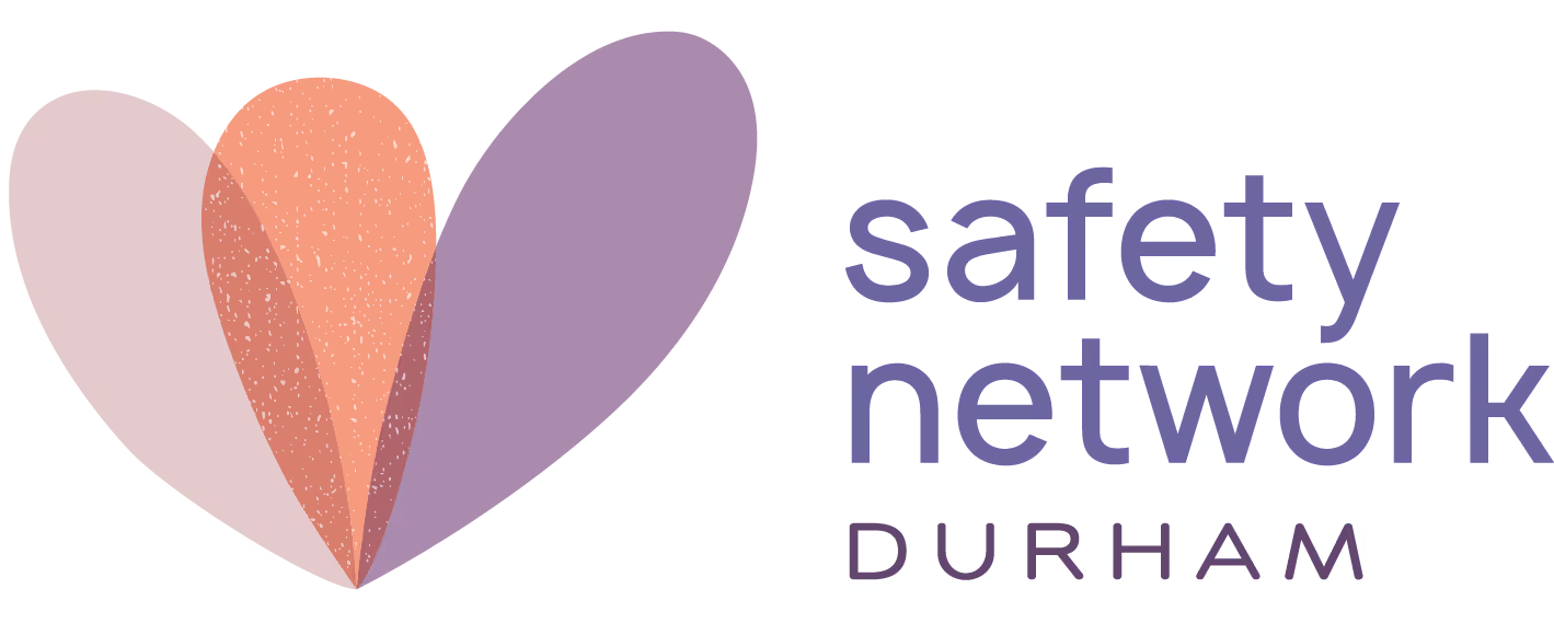
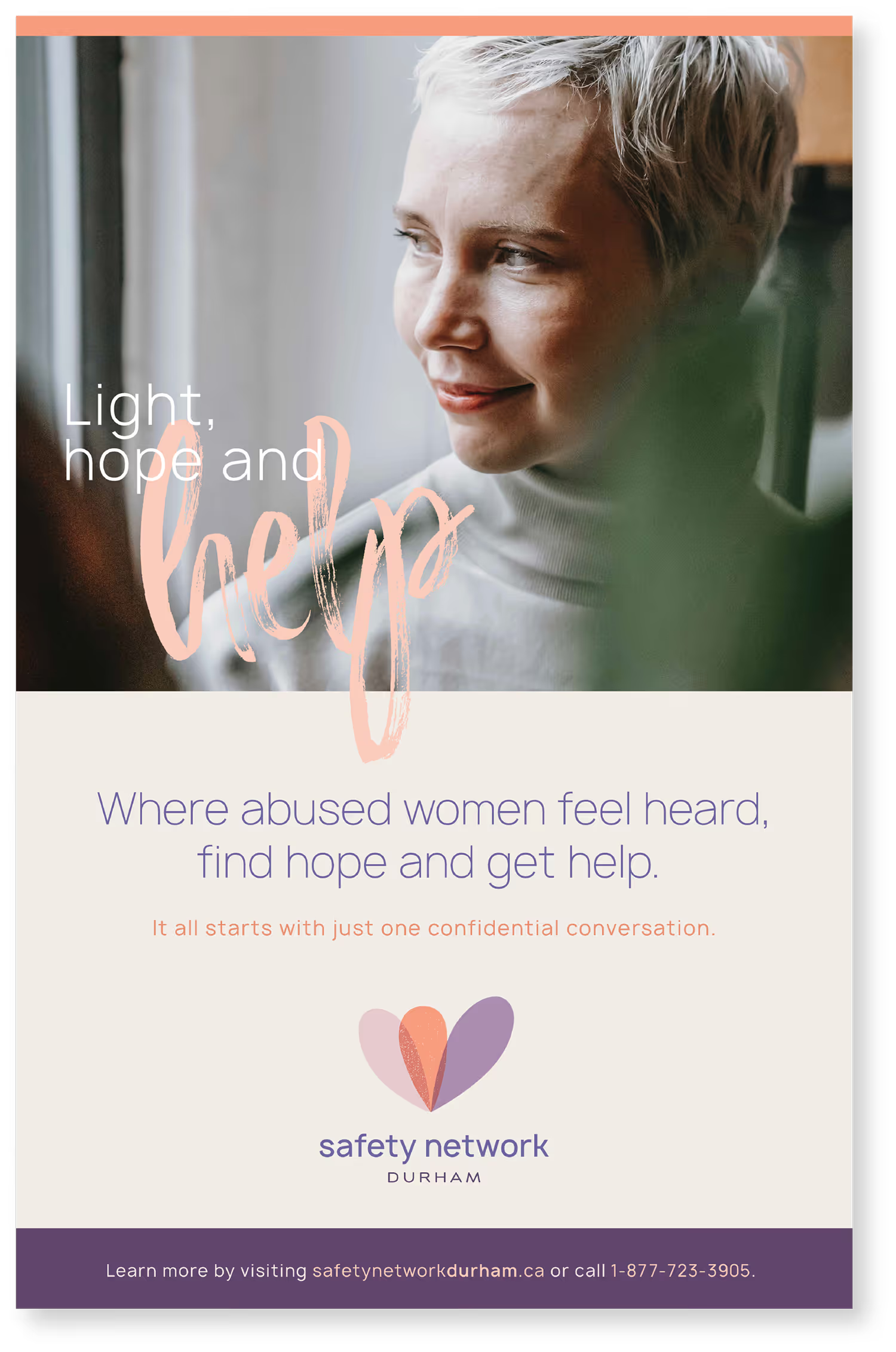
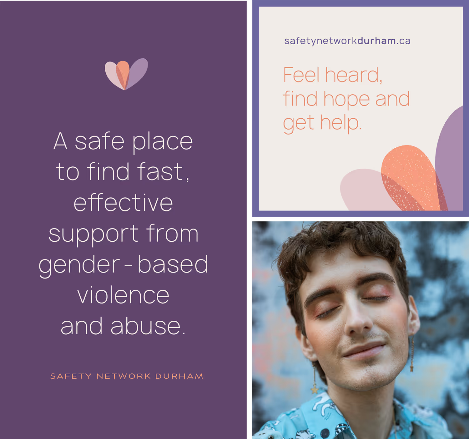
Safety Network Durham was an established and trusted brand, and its visual identity provided a strong foundation to build from. Its emotional, hopeful visual language anchored in an abstract tulip-inspired icon symbolizing growth, safety, and empowerment — helped shape a modern brand presence that feels human and supportive. Thoughtful typography, an approachable colour palette, and accessibility-forward design choices ensure the brand is both welcoming and clear across every touchpoint.
Heading
The CFSD master brand brings these elements together through a clean, neutral foundation— using soft charcoals, warm beiges, and restrained pops of colour drawn from each sub-brand. Its abstract icon integrates visual references from all three divisions, symbolizing unity, shared purpose, and collective impact. A simple, modern sans-serif word mark ensures clarity and cohesion across all applications.

