
A Renewed Brand to Amplify Generosity & Impact
A refreshed brand identity and storytelling system designed to align vision, voice, and impact.
London Community Foundation was stepping into an important new chapter. With a new Strategic Plan defining its direction, the Foundation needed a refreshed brand that could more clearly express its significant growth and community impact and where it was going next.
This was a moment where strategy, storytelling, and identity needed to come together.
sagecomm partnered with London Community Foundation to evolve its brand positioning, visual identity, and storytelling foundation in a way that reflected the clarity and importance of its new strategic direction. The work needed to honour the Foundation’s trusted role in the community, while creating a more confident, accessible, and emotionally resonant look and feel for the years ahead.
Following rapid discovery to understand goals, needs, pain points and opportunities, a refreshed brand system was designed to bring greater clarity and cohesion to how London Community Foundation shows up across London, Middlesex, and neighbouring First Nations. Informed by the Foundation’s new Strategic Plan, the identity translated big ideas like stewardship, generosity, trust, equity, and lasting impact into a brand that feels mature, warm, locally grounded, and future-facing.
At the centre of the refresh was renewed narrative positioning. Anchored in the idea of “Generosity that Lasts,” the refreshed positioning clarified how London Community Foundation exemplifies stewardship, partnership, community impact, and its role across London, Middlesex, and neighbouring First Nations. Supporting messaging and narrative tools helped create greater consistency, confidence, and emotional resonance across every audience touchpoint.
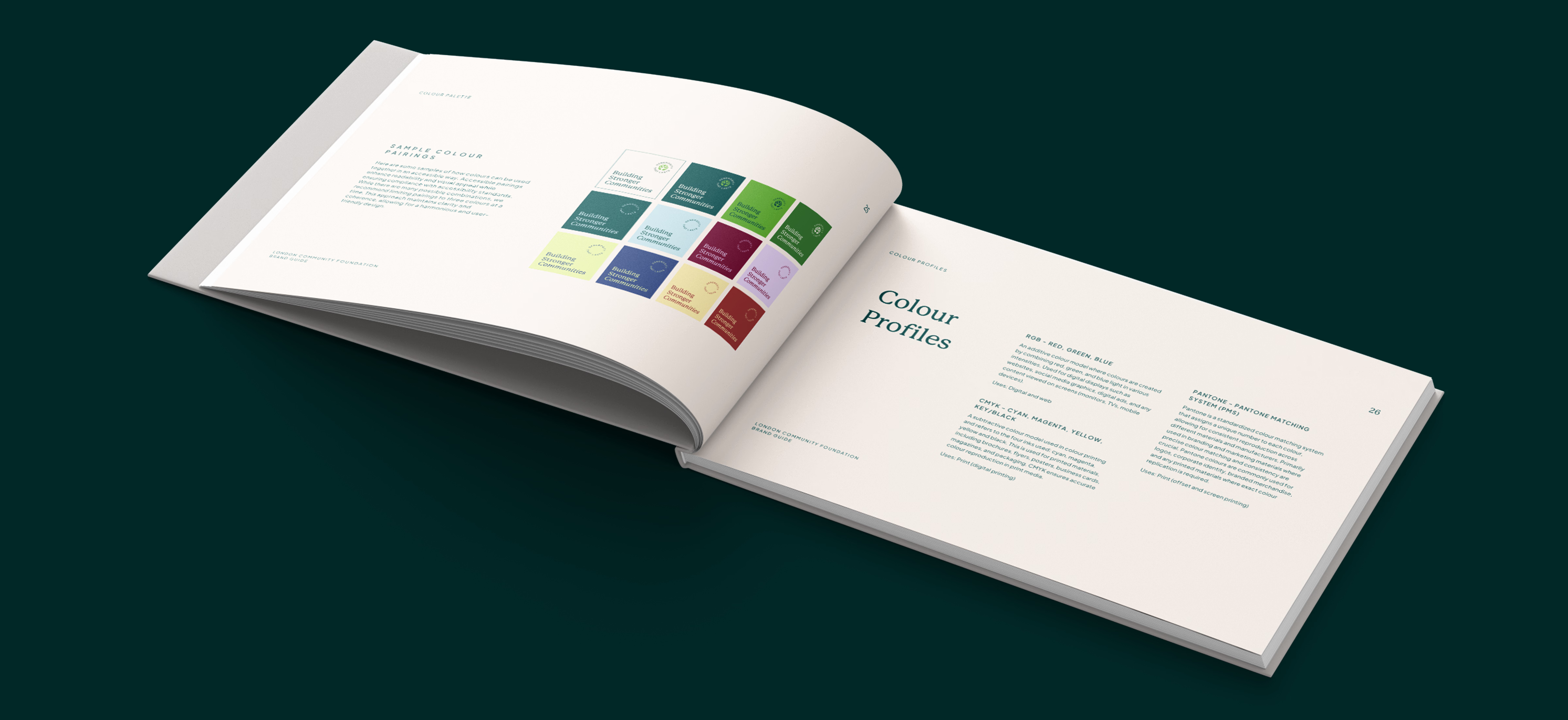
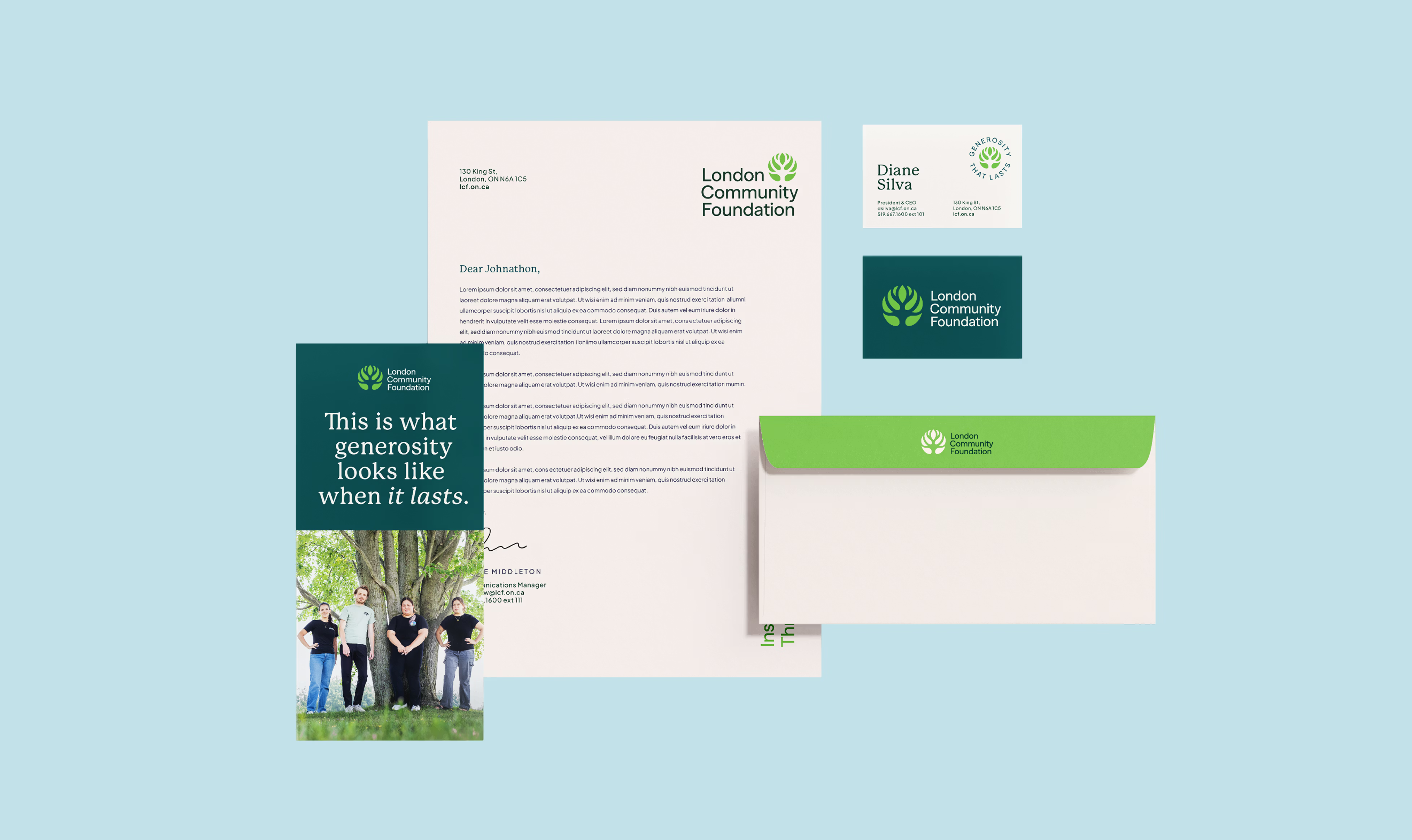
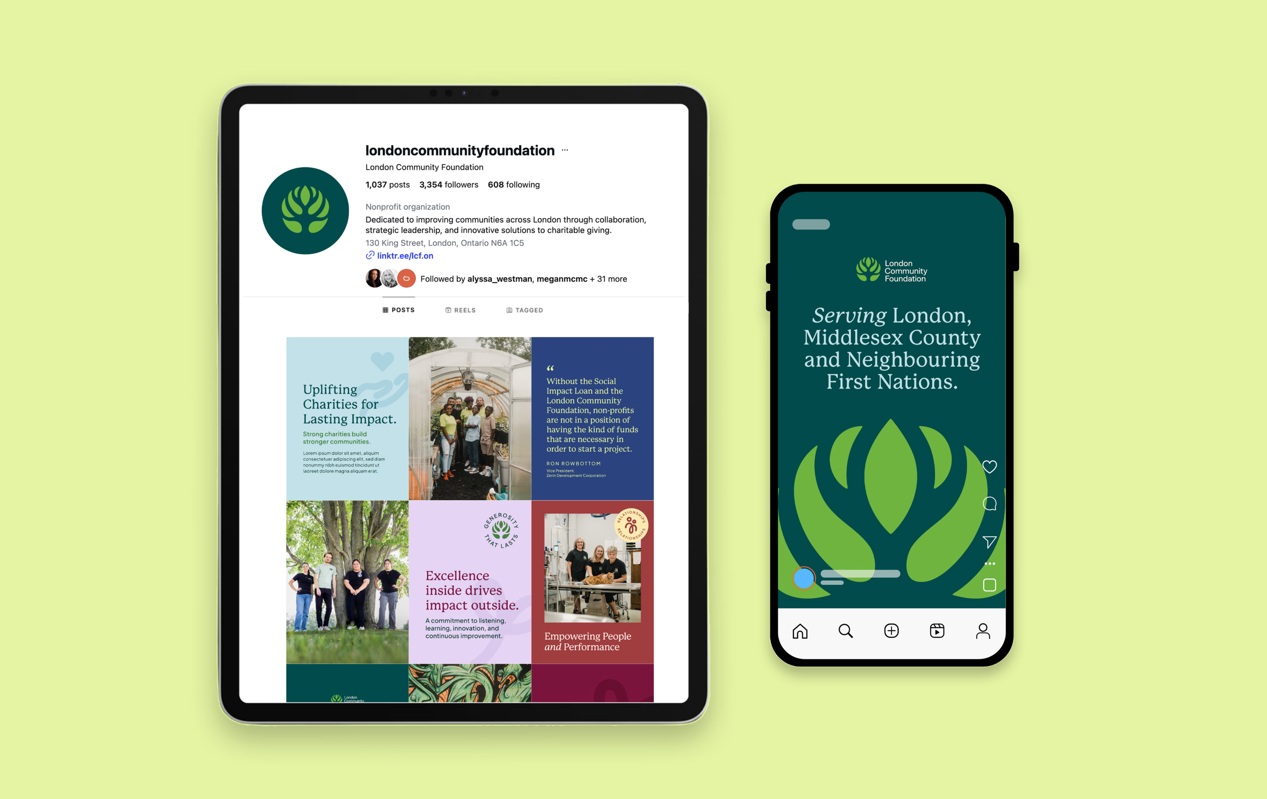
Visually, the work included an evolved logo identity, expanded colour palette, typography system, iconography, photography direction, and practical brand guidelines. Together, these elements created a flexible and accessible identity system that could support everything from high-level strategic communications to everyday donor, partner, and community-facing materials.
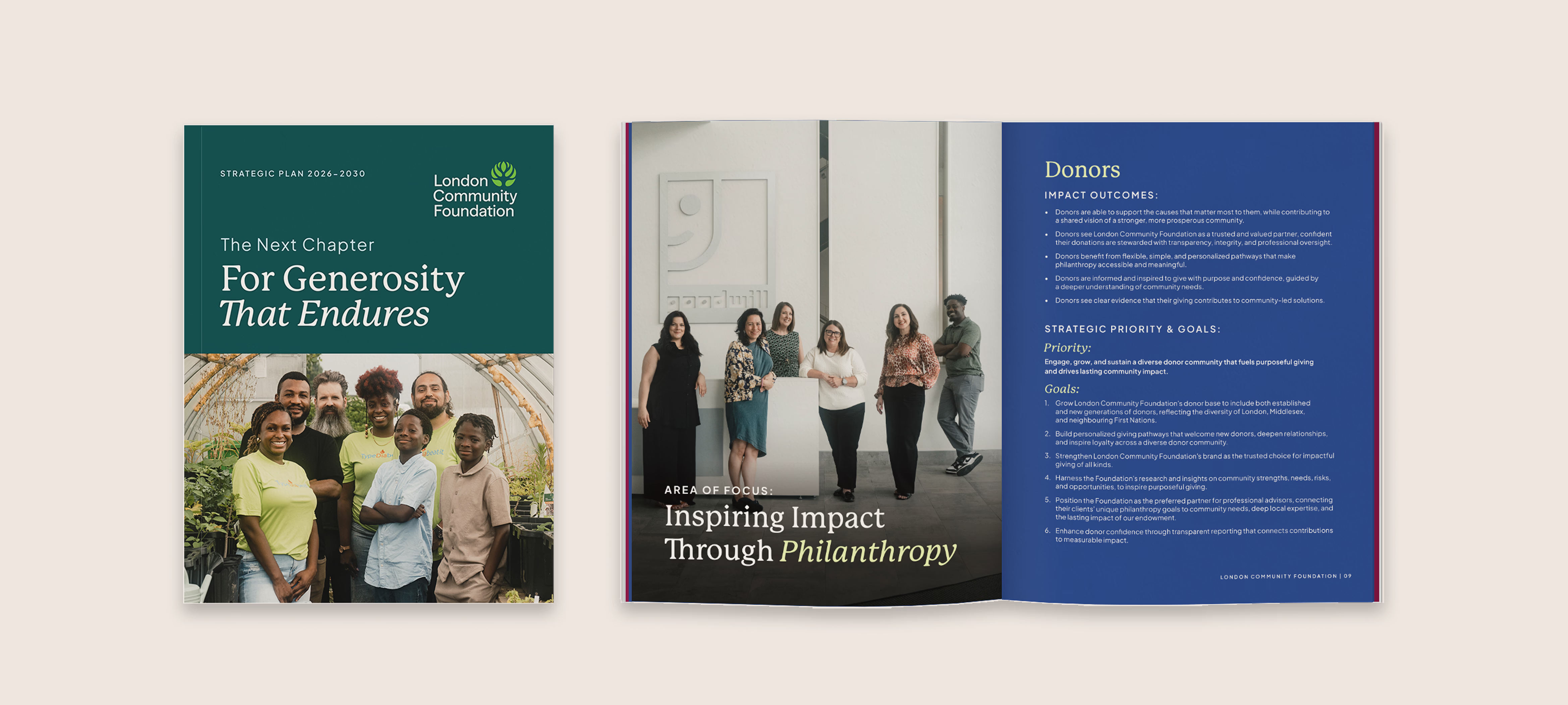
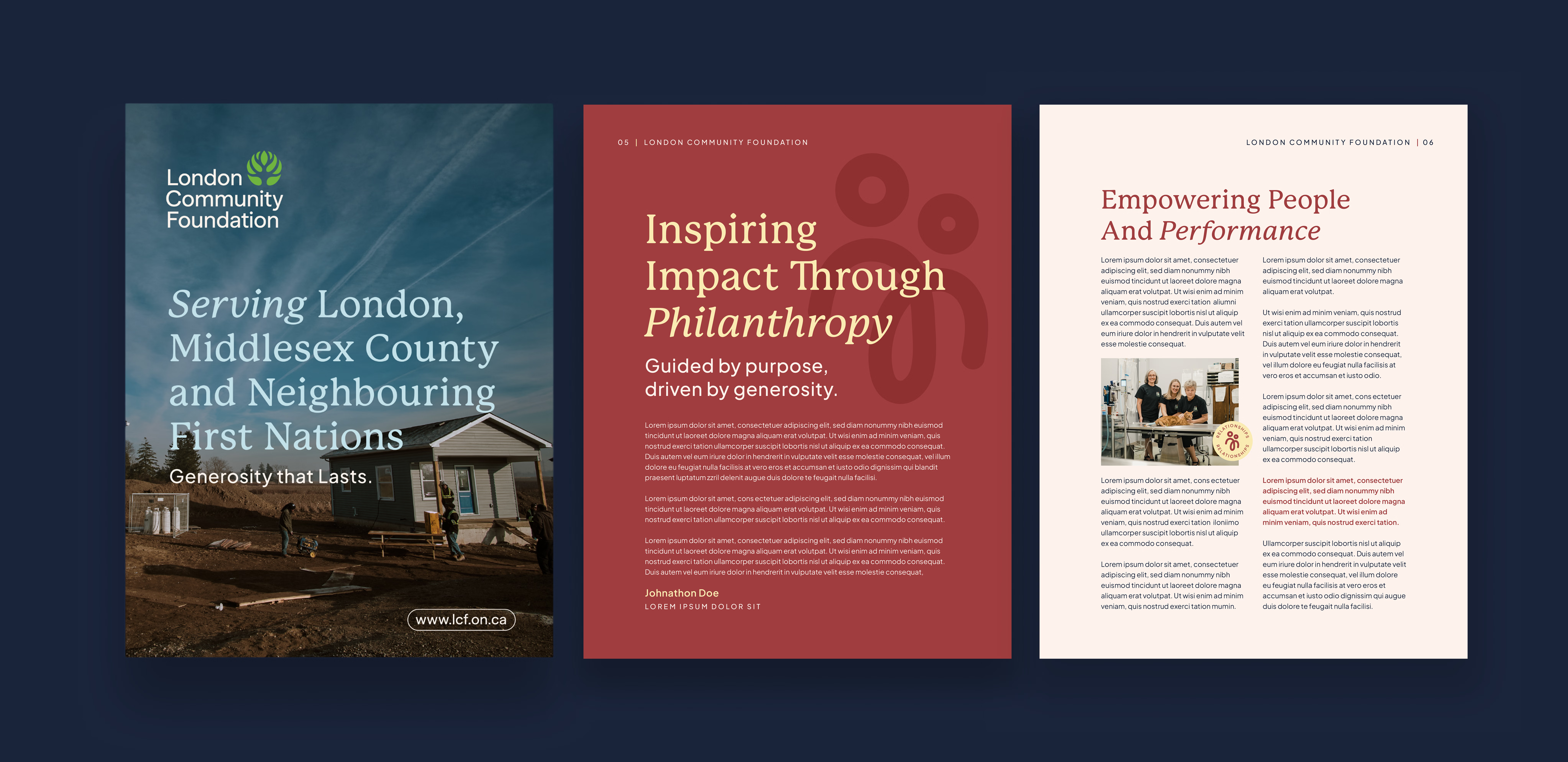
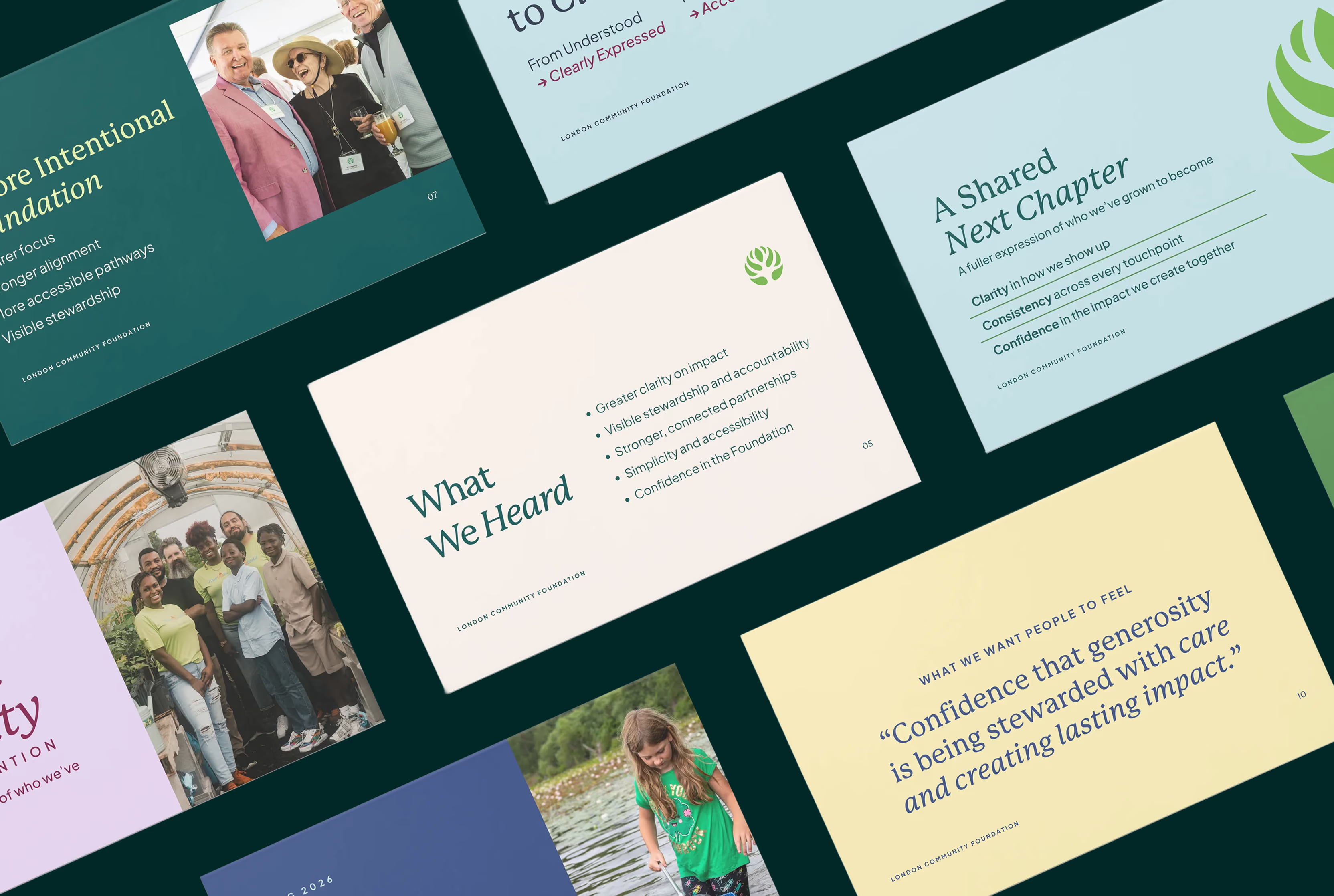
That refreshed positioning and visual direction then became the root for a broader set of strategic storytelling tools. The work informed the final design of the Strategic Plan and a series of new communication tools, creating a consistent experience across every major organizational touchpoint.
The result was a refreshed brand and storytelling system that gave London Community Foundation a stronger platform for connection. It made the Foundation’s purpose easier to see, its strategic direction easier to understand, and its role as a steward of generosity easier to feel.
Most importantly, it helped create a more cohesive experience for fundholders, donors, charities, partners, volunteers, advisors, and communities as they engaged with the Foundation’s next chapter.
Services Delivered
- Research & Discovery
- Narrative Positioning
- Brand Strategy & Design
- Strategic Plan Design
- Custom Asset Design
- Asset Template System
- Rollout Communications
Sector
Featured work samples
.avif)
.avif)
The refreshed brand feels truly, authentically us and future-facing. It reflects not only the heart of our work, but also the responsibility we carry as stewards of generosity and community impact across London, Middlesex, and neighbouring First Nations. The positioning and identity now much more clearly reflect the work happening across the organization, while helping people better understand the Foundation’s vision, values, and commitment to building stronger communities for generations to come."
.avif)
.png)