Evolving a Trusted Brand to Connect More People to Care
For more than four decades, Regional HIV/AIDS Connection (RHAC) has been taking action against stigma through care, advocacy and community. Based in London, Ontario, and serving six surrounding counties, the organization connects people affected by HIV and Hepatitis C to compassionate support, essential services and a trusted network of community partners.As community needs changed, RHAC’s work grew in breadth and complexity. Its services responded to increasingly interconnected challenges, including the poisoned drug crisis, housing instability and barriers to care. But in a resource-constrained environment, its brand and website were not able to keep pace. RHAC needed a clearer, more cohesive way to communicate the full scope of its work, while preserving the history and trust that continues to make it such an important community resource.sagecomm partnered with RHAC to bring its story, visual identity and online experience into alignment. Together, we set out to create a brand that reflected the strength and humanity of the organization, supported its future growth, and helped people understand where to turn for care.
The work began with research and discovery, including sessions with Education and Client Services teams and volunteers, interviews with community partners, and ongoing collaboration with RHAC’s project team. These conversations revealed a shared priority: a brand that felt current, credible and welcoming, with accessibility and inclusion informing both its design and its everyday use.
A renewed narrative position brought that direction into focus. Grounded in connection, compassionate care and advocacy for change, it articulated RHAC’s role as both a place of support and a voice for progress. Supporting messaging and positioning guidelines gave the team a consistent foundation for communicating with clients, donors, partners and the broader community, with language that felt knowledgeable, reassuring and human.
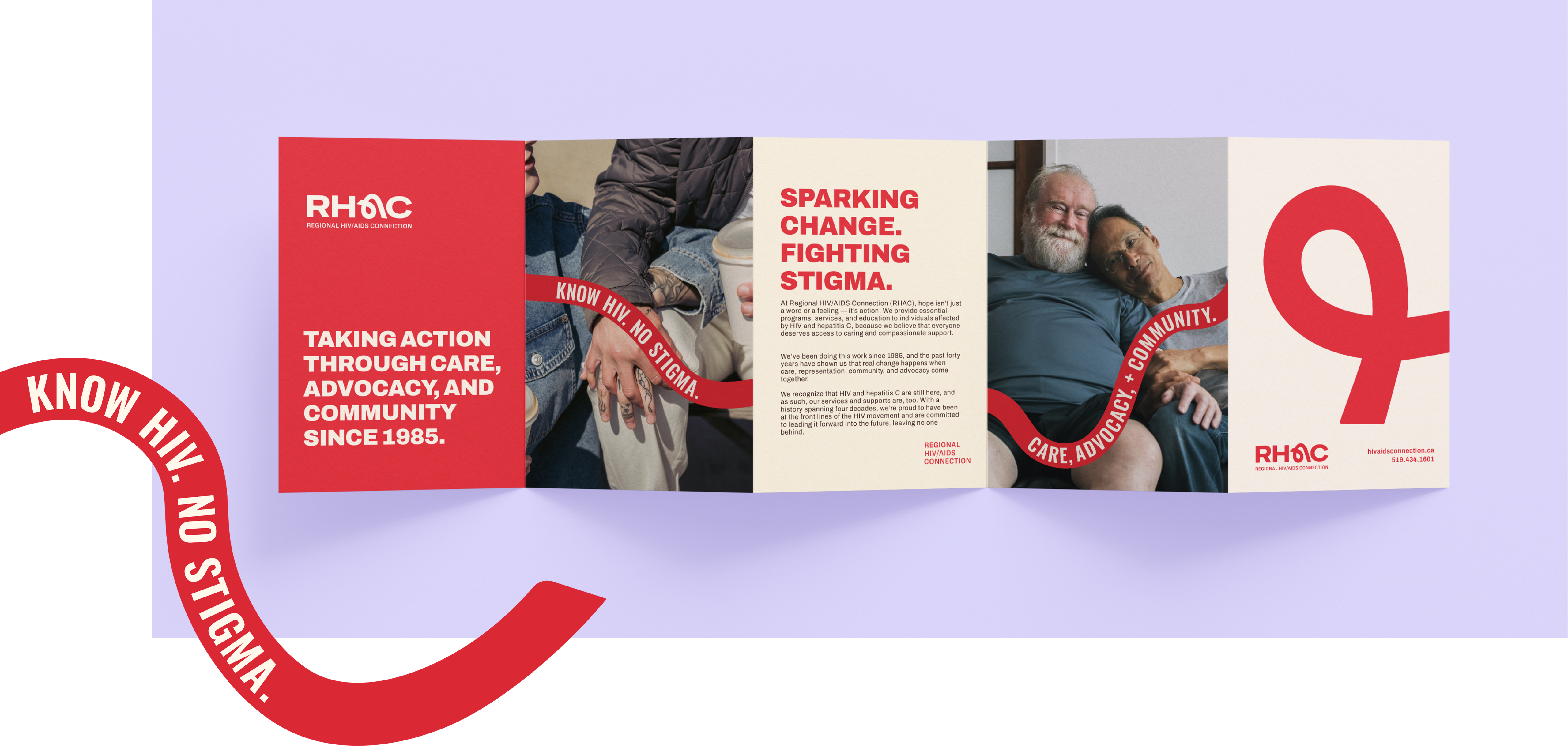
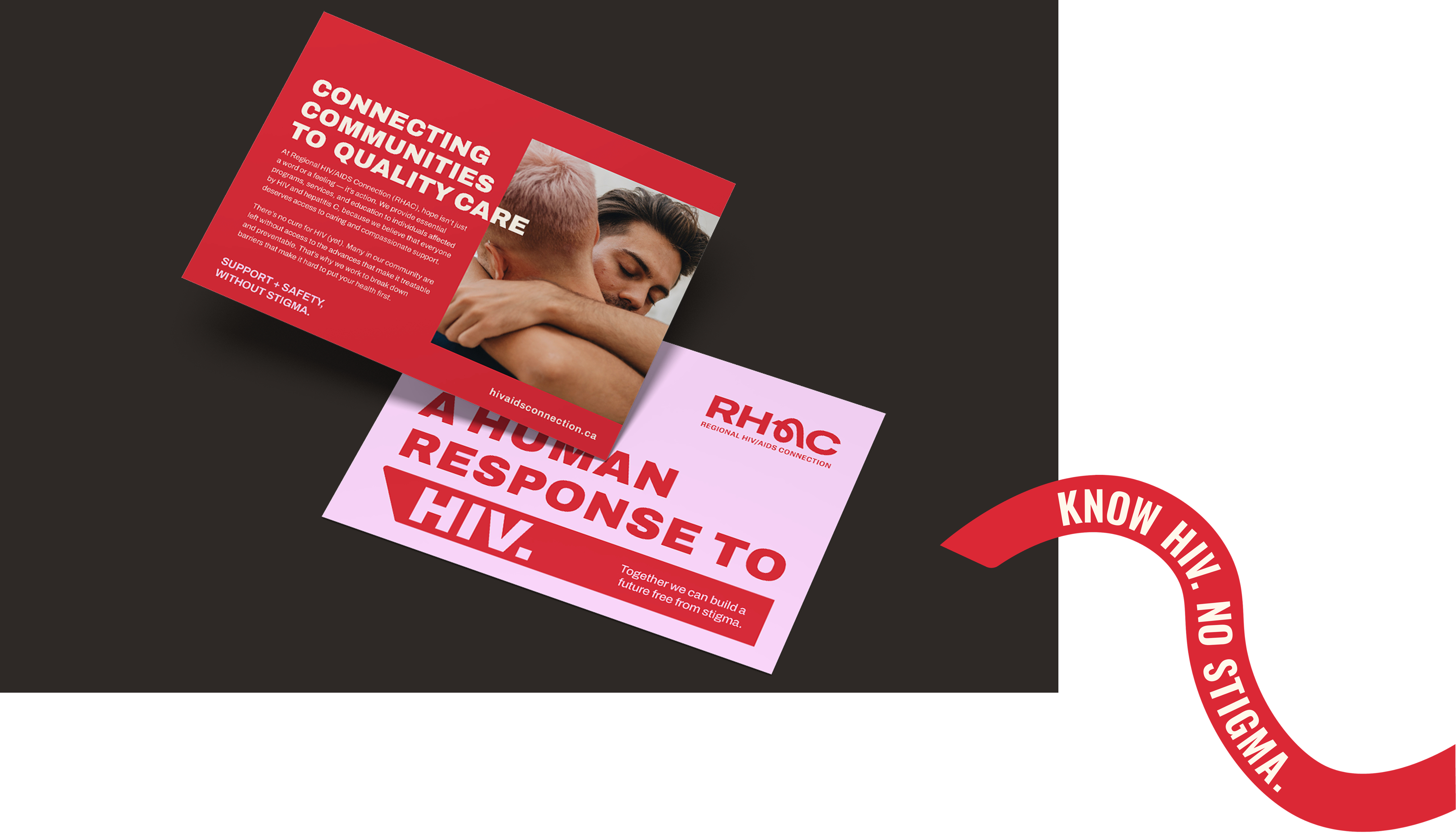
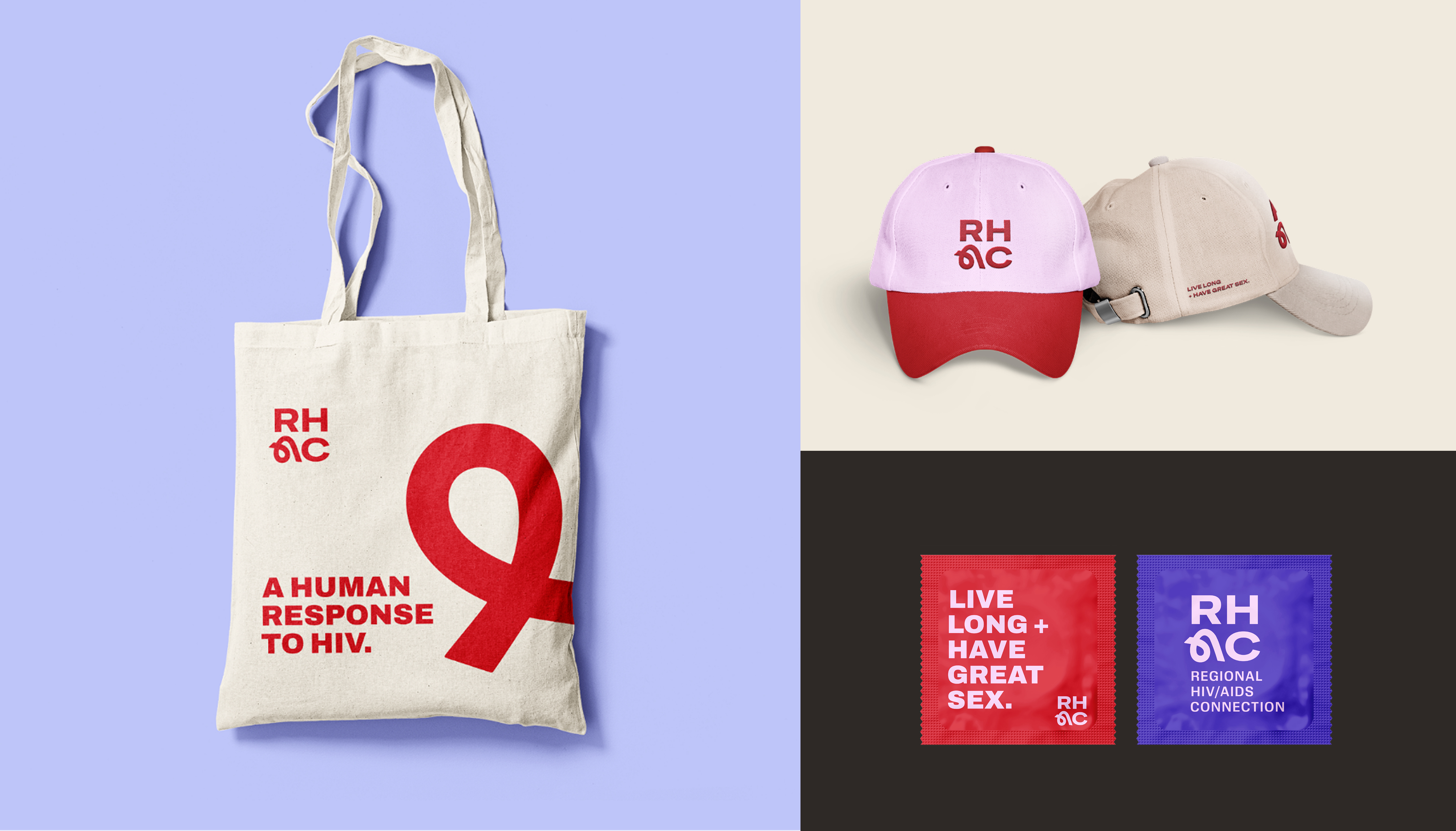
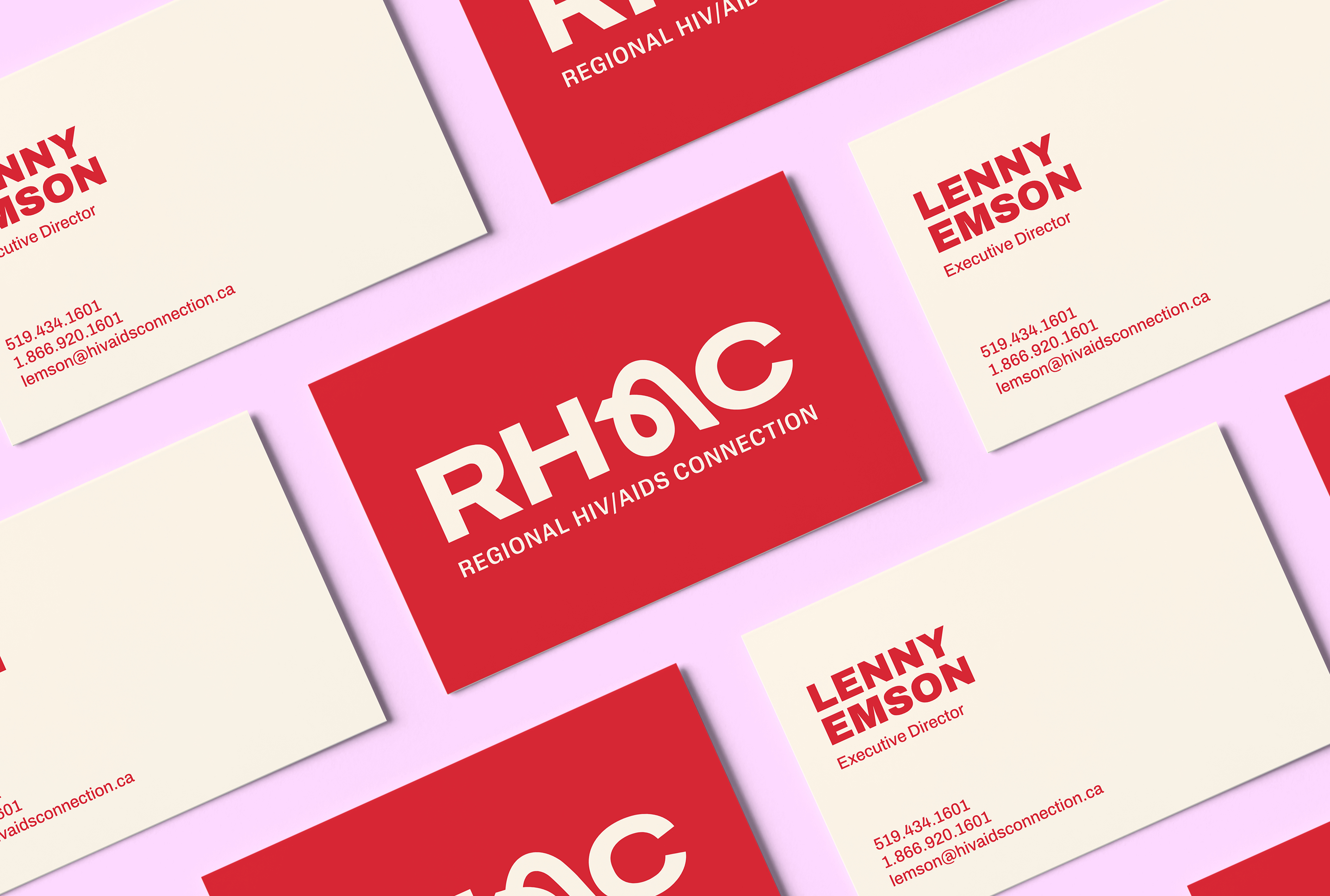
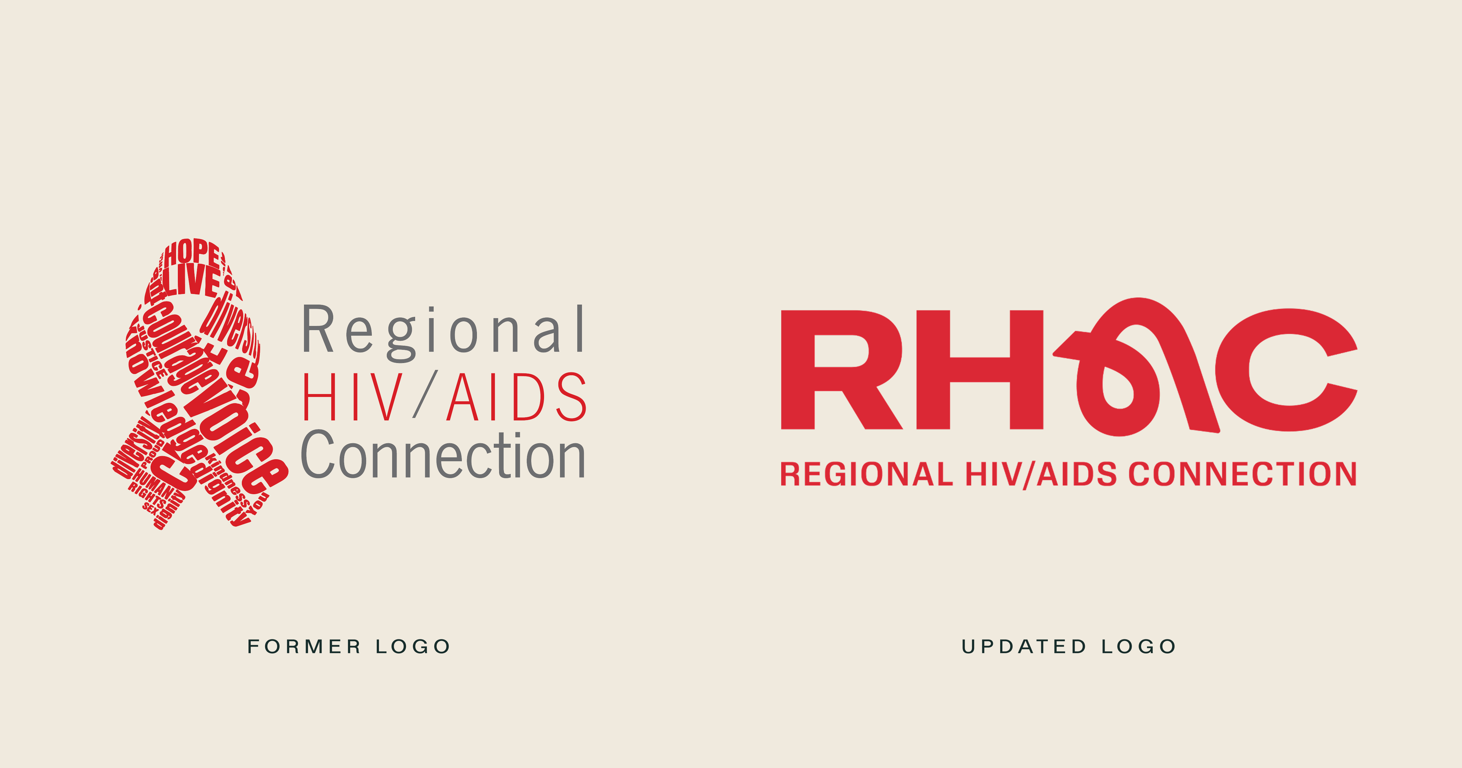
The visual identity carried that same balance forward. The new logo puts RHAC front and centre, integrating the iconic red ribbon directly into the acronym. Bold letterforms express strength and stability, while the ribbon’s fluid shape brings warmth, care and connection into the mark.
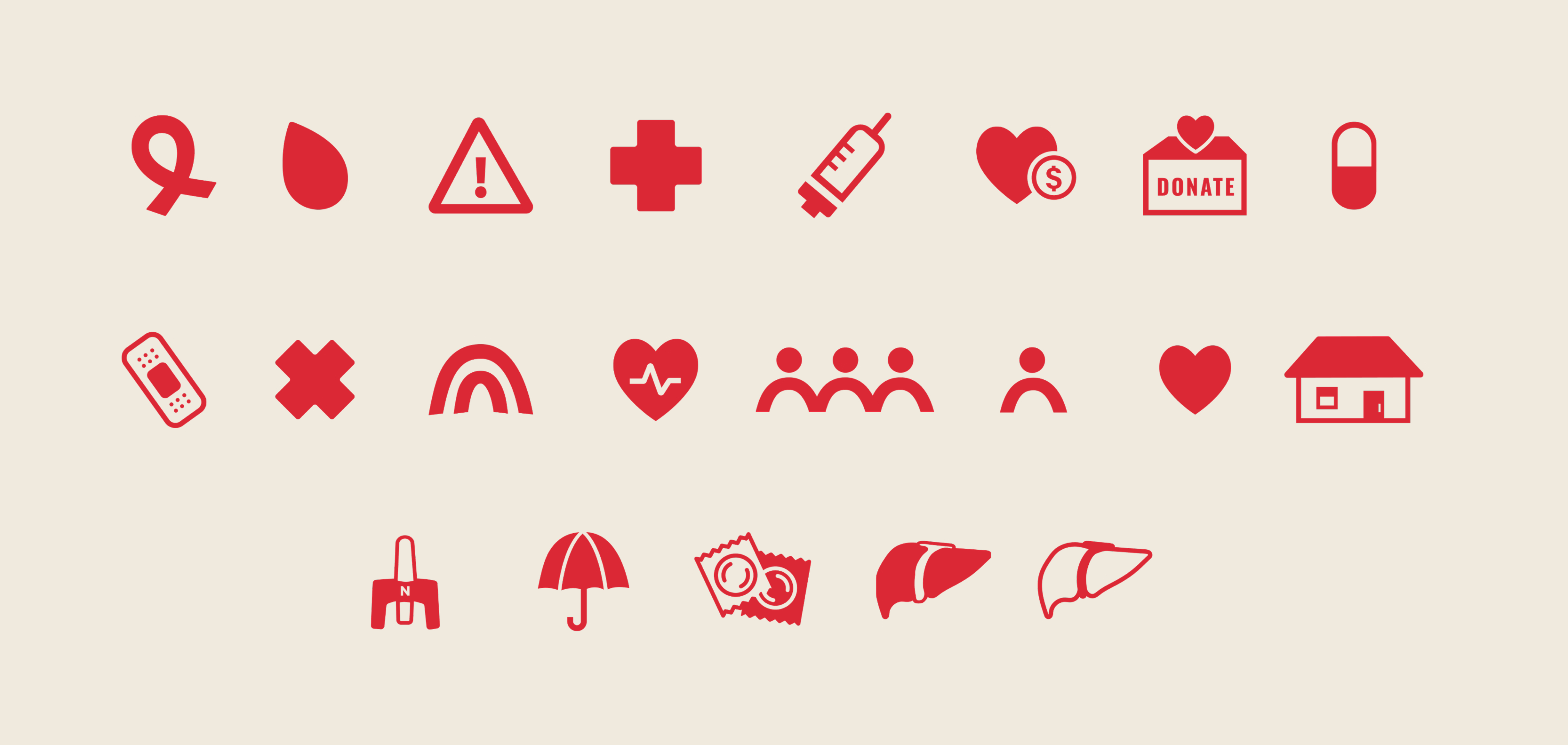
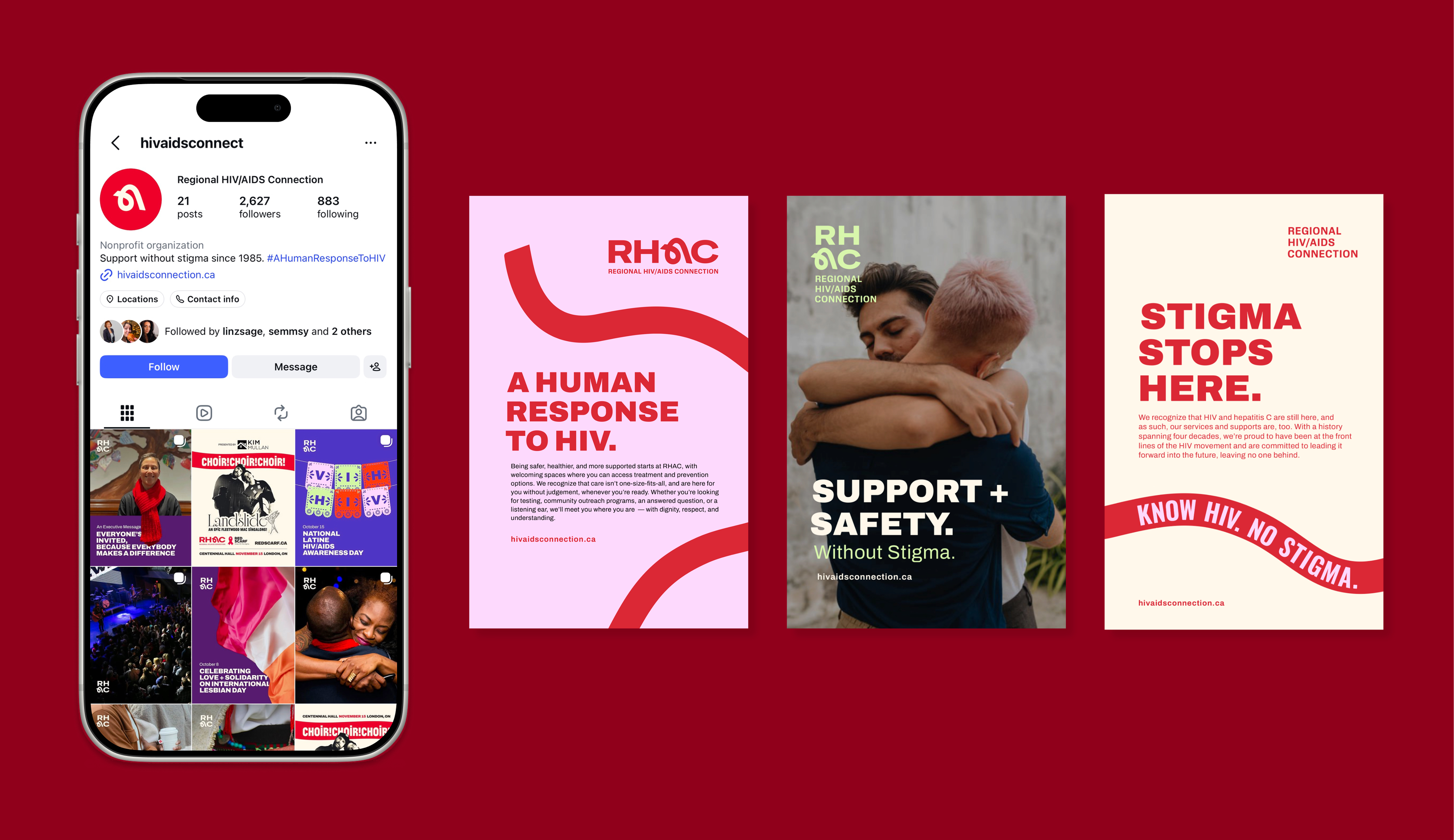
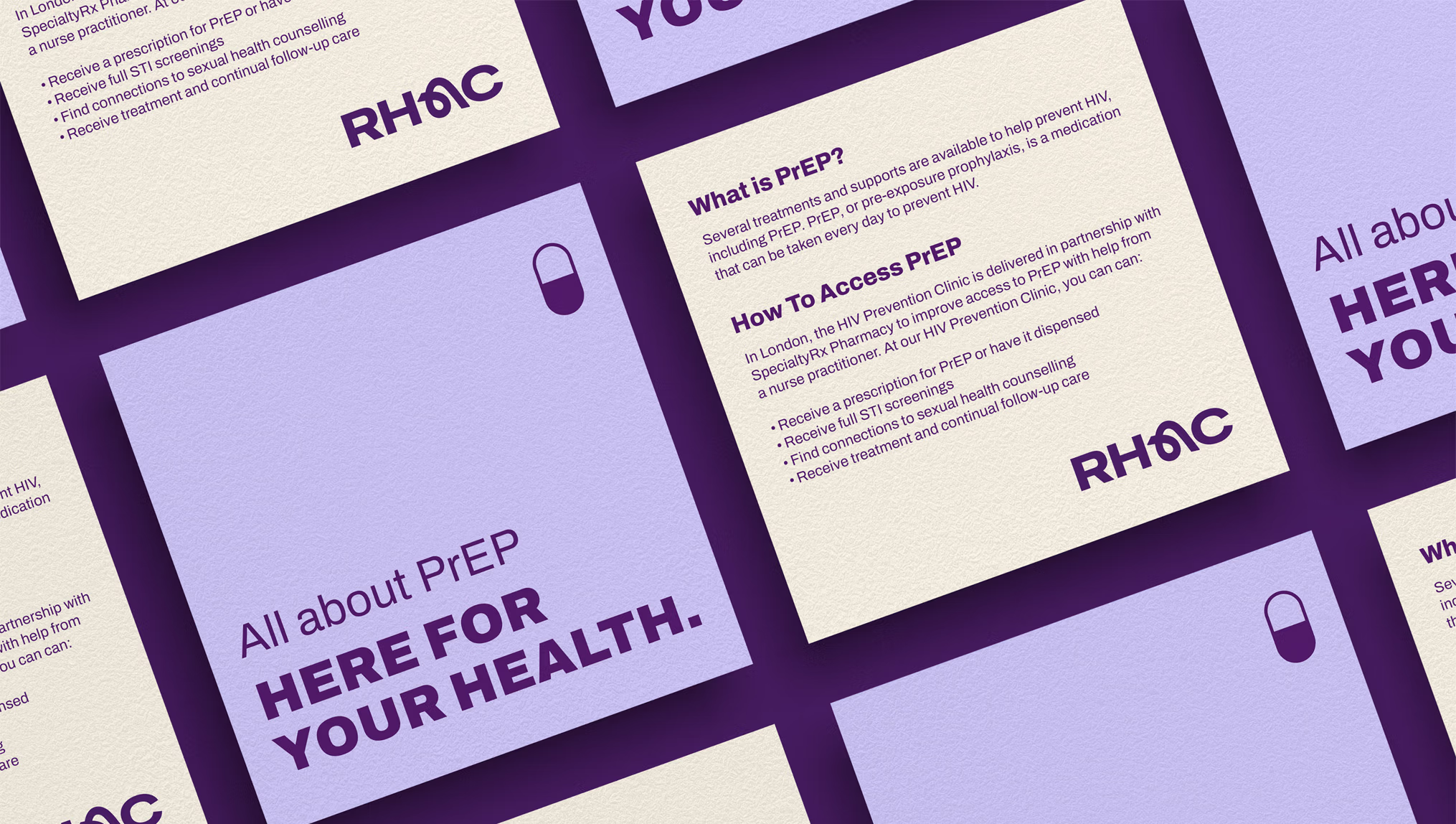
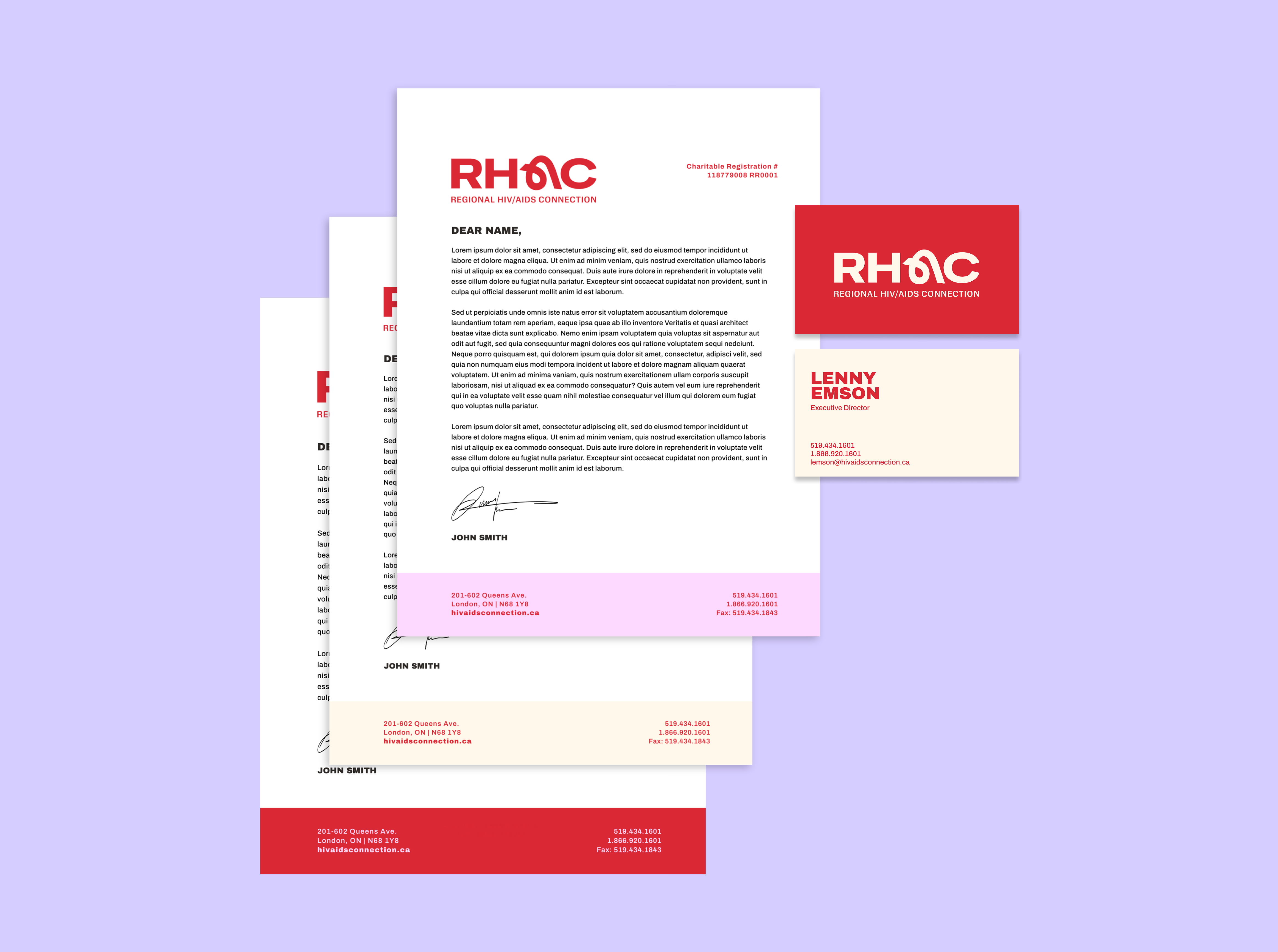
Beyond the logo, the ribbon became a flexible storytelling element, its winding paths reflecting individual journeys and connections to RHAC. An expanded colour palette, clear typography and custom icon system created room for the brand to communicate across different programs, causes and audiences. Practical guidelines brought these elements together into a cohesive system that could support everything from essential health information to community outreach and advocacy.
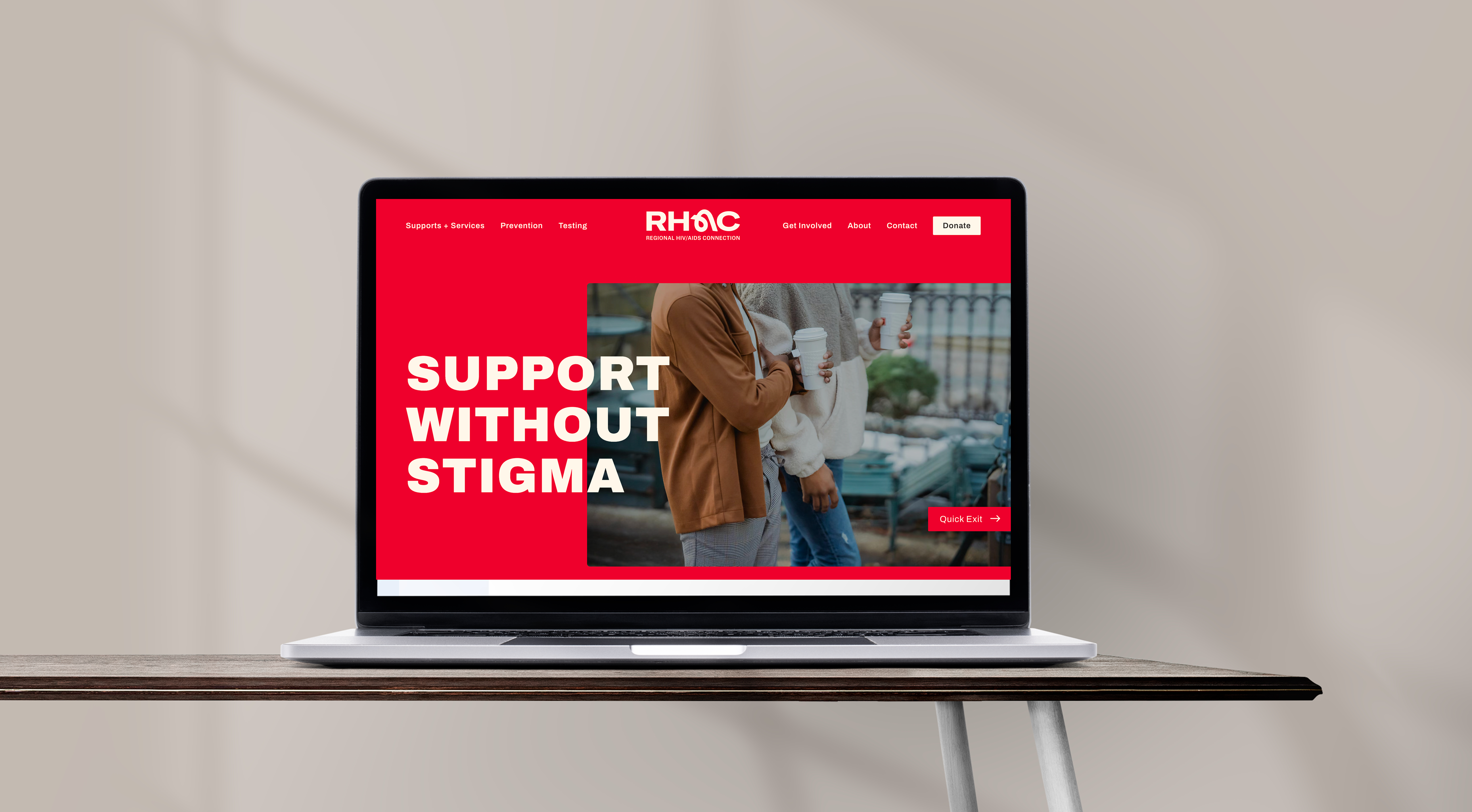
That renewed identity also shaped a rebuilt website, with a clear priority: connecting clients and potential clients to programs and services. The website was designed to answer the questions that matter when someone is looking for help: How can RHAC support me? Where do I go? Who do I contact?
Clearer navigation distinguished services from the locations where they are delivered, while contact information helped people identify the right next step. Dedicated pathways supported donors, volunteers and community partners. Responsive design and accessibility considerations guided the experience across devices, bringing the brand’s promise of care and connection into a practical online resource.
Together, the work gave RHAC a clearer story, a more flexible identity and a website designed around the people it serves. It created a stronger foundation for communicating its impact, supporting community relationships and helping people take that first step toward care, with a brand and digital experience built to grow alongside the organization and its community.
Services Delivered
- Research & Discovery
- Narrative Positioning & Key Message Development
- Brand Strategy & Visual Identity Design
- Custom Asset Design
- Asset Template System
- Rollout Communications
- Website Strategy
- Website Content Development & Copywriting
- Website Development
Sector
Featured work samples
For RHAC, rebranding is about more than appearances. Our brand is the familiar face that clients look to for care and support. In many ways, it is a front door to the organization that needs to be accessible and welcoming by design. The team at sagecomm understood this. They demonstrated the deepest care for the communities and mission we serve, delivering a brand system that builds on our strengths and drives our mission further. As an organization that has served the community for more than 40 years, it was important to work with partners who shared in the respect for our history and a vision for our future. We are very proud of sagecomm’s contribution to the visual identity and culture of our new brand.